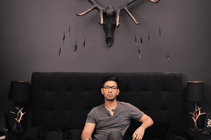
Arthur was born and raised in New York City, a 1st generation Chinese-American boy with a love for the arts. His interest in art began almost immediately as he won local competitions starting in elementary school, and as he entered high school his interest in the occult began to pique. It wasn’t until his senior year of high school that he began to see art as more than a hobby. At the urging of his teacher, he applied to art school and, while gaining acceptance to all his choices, decided to attend the Rochester Institute of Technology, where there was a thorough mix of both the arts and sciences. He graduated with a BFA in Illustration, though also grew fond of psychological and anthropological studies during his time at college. After teaching art in Brooklyn for a year, Arthur decided to investigate the more research and user-oriented aspects of art through the lens of product design. Two years later, he graduated from the Savannah College of Art and Design with a Master’s in Industrial Design, and has since been working full-time in the field.

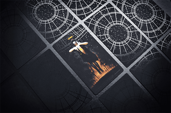
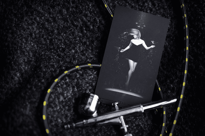
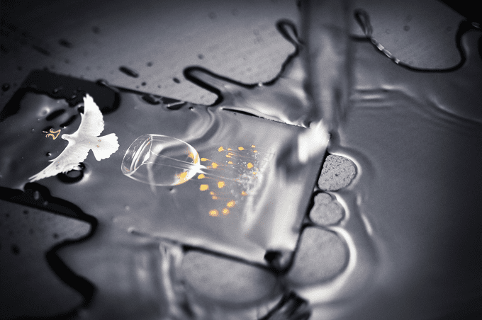
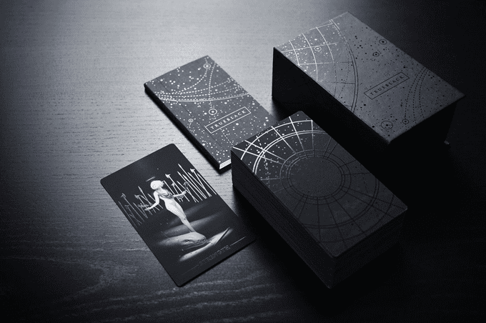
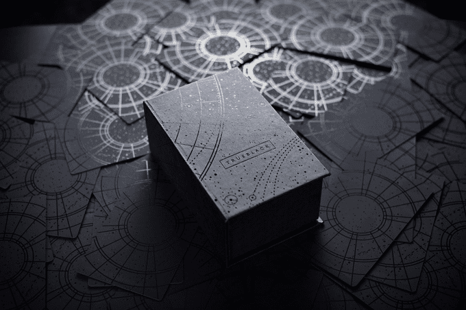
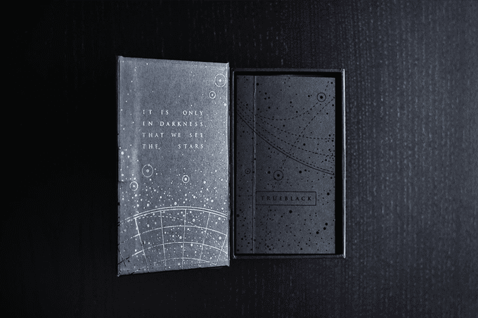
One year ago, he started to paint True Black. True Black is a 78-card tarot deck, complete with magnetic closure box and accompanying booklet. The box, booklet, and every card’s front and back are adorned with black-on-black gloss/foil stamped designs. Core to the concept of True Black is exceptional and unparalleled quality, both in its imagery as well as its construction and manufacture, setting a new standard in build quality and execution. Where the artwork speaks of timelessness, the deck will stand up to the rigors of everyday use.
What inspired you to create this tarot deck?
I was searching for my first tarot deck online and I actually saw one that I thought looked very good, but only from a distance. After inspecting it closer, it seemed to me that the style of the artwork was very modern and trendy, but from my design background I understood that trendy things have a habit of peaking in the “now”, but wind up looking outdated soon afterwards. I kept searching around and kept finding that most modern decks seemed to have this quality of trendiness, whereas older decks most definitively showed their age through the archetypal medieval or Baroque, almost exclusively western, visual styles. It was really at this point that I challenged myself to make a deck that would be difficult to place in any specific geography or time-period, something that could feel simultaneously new but also hint at the familiar. That’s really where the start of True Black came from. I wanted to make a deck that felt timeless, and I wanted its construction and build quality to reflect this exceptionally tall order.
What was your initial thematic vision when creating the deck, has that vision changed at all during the creation of this deck?
I started to think of this deck as an artifact of our human psyche, and I choose the word “artifact” to be a physical object that an unknown civilization has left behind. I wanted to see the tarot through the eyes of something removed from ourselves, something that studies and watches us but is not among us. It’s through this lens that I portrayed the objects and figures to be floating in a field of nothingness, spotlit from above in what could be a museum or stage. This tarot is the study of us, our dreams and fears on display in a museum of us. If this hypothetical civilization is far-enough removed from us, what would the collective clothing of humanity look like to them? Would they be able to make out specific faces and identities, or would we all be vague figures? One thing that I realized we all had in common was the stars. Every human civilization from every continent has seen eternity in the stars, and awed at them the same way a child does today. I knew that this would be a theme I wanted to carry on throughout the deck; the omnipresent hopes and fears that all of human civilization shares, projected and embodied by our collective love and fear for the stars and the unknown.
What are your favorite tarot decks? Do you feel they’ve inspired True Black in any way?
The Visconti-Sforza decks are among my favorite. They are gorgeously and richly illustrated, which makes sense given their intended audience, but despite how elaborate the linework was or how sprawling the background patterns were, there was a simplicity and straightforwardness to those cards that I greatly admire. The images had “a lot going on”, but you never got lost in them. I don’t think I realized it until you asked this question, but I think I subconsciously tried to emulate that straightforwardness!
Which card is your favorite in the deck?
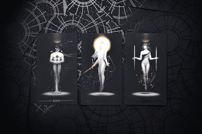
Oh boy! That’s like asking a parent who their favorite child is! It is cruel and unusual, but I’ll answer it anyway. Visually, of course, I love many, many cards in this deck. I’m a perfectionist so I don’t really send something out into the world until I believe it’s amazing. However, to help narrow things down, if we couple the visual with the meaning, my favorite is the Queen of Swords. Chief among the meanings of this card is honesty and fairness. I’ve painted her with a sword at each side, one levitating between her fingers while another pierces through her hand. This is somebody who faces the unpleasant truth, refuses to cheat and trick her way out of a situation, and accepts the consequences of her actions. I think of the tarot as a compendium of fears, hopes, and guidance to navigate the two, and I think the Queen of Swords carries a message that very many of us need to be reminded of. Too often we give ourselves the benefit of the doubt while we cut into others as quickly as we see the slightest of flaws. It is unfair and it is cold, and the Queen of Swords reminds us that we must be subject to our own standards.
The card stock blows me away. I’ve never seen the tarot printed on anything like this. Can you talk about what makes this card stock unique and your thinking process behind it?
There are a lot of things that make this card stock exceptional! With a deck that speaks to timelessness, I wanted to make sure that its construction was also the best I could possibly make. Firstly, the stock is 18pt thickness, which is about 50% thicker than your standard store-bought RWS deck. They feel very solid, and more like a slab than a card. I want every single card to feel like something you can hold close to you and treasure, a singular artifact. Most noticeable is the coating on this card, which makes it, might I say, absurdly matte. It reflects nearly no light, so the blacks on the card are an exceptionally deep black. I hated how many cards have a glossy treatment that bounces glare off so you can only look at the card at certain angles, so I made sure these cards didn’t have that problem. The artwork looks the way it’s intended to look 100% of the time, and with the card titles and selective spots glossy, the only thing that reflected light does is accentuate the content. The same coating also makes the card very tough, scratch-resistant, and incredibly water-resistant. Again, I wanted maximum quality so we’re pulling out all the stops!
The figures on the cards are beautiful. There’s a sort of androgyny and ambiguity in regards to the gender of a lot of them. Are these modeled after real people?
Yes! Every figure is a friend of mine. Well, some may have started out as a friend-of-a-friend, but through the process of making this deck we’ve all gotten a lot closer. The androgyny you’re noticing is surprising, as I never suspected it to be so noticeable, but also appropriate. The vast majority of the models for these paintings are queer or members of alternative subcultures, so it makes sense that some figures appear sexually ambiguous. I didn’t want to make their sexual orientation a selling point so I never advertised it anywhere, but I did want to buck the historical trend of tarot having very set parameters of what masculine or feminine energy looks like. A good example is that two of the four Knights are portrayed by females, both of whom I personally know to have fiery and, in one case, stubborn passions.
One of the things that I think is so striking about this deck is how minimalist it is while still retaining the very heart of traditional symbolism of the tarot, even if it’s expressed a bit differently. A lot of minimalist decks tend to be too simple, while other decks are overly cluttered. Why did you choose to go with a minimalist approach?
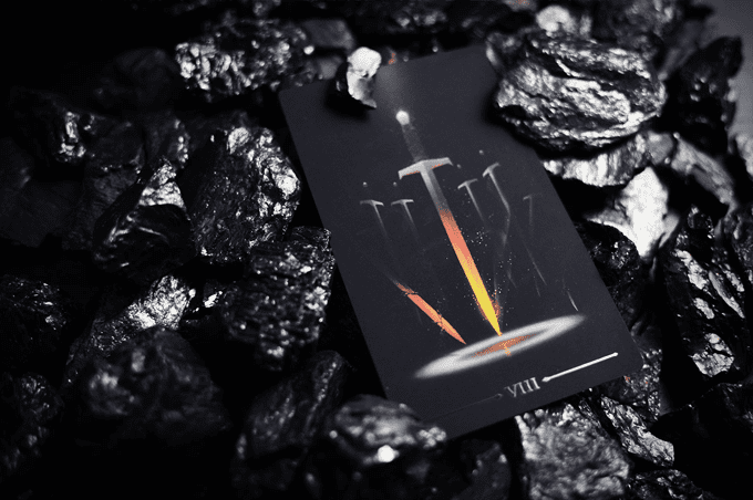
It’s probably my design background! When we strip the field of anything unnecessary, what’s necessary is so much easier to grasp and understand. I started painting figures and objects on a black background a long time ago, and I think for this very reason. Our eyes are drawn to what is there, and all of this deep black recedes into the background, creating the perfect stage for the symbols that we hold dear to shine and take the spotlight.
What are your plans for the deck from here?
Well, I want to keep the Kickstarter going as strong as I can! I’ve introduced a number of stretch goals that, if funding meets, will add an additional card to the deck; being a brand new card named “Anant”, Hindi for “endless”. With this card I want to embody the simultaneous feeling that within the grand scope of the universe we are so very very small, while at the same time our very small experiences and lives are the biggest things we will ever have. The Indians were one of the first civilizations to study cosmology, and regarded the universe as infinitely complex and simultaneously within our own selves. If the Kickstarter meets these additional funding goals, I’ll also be donating funds to aid in the recovery of the recent hurricanes in the Caribbean as well as to organizations that help establish LGBT equality. I want this deck to keep on giving!
Any other projects that you’re working on or on the horizon?
I have some ideas in the fairly-distant horizon, though I consciously try to avoid thinking about them too much so I can stay centered and focused on True Black! With that said, I had thought of creating a sister deck to this one, with a very light-gray and nature/exploration-based feel to it, with a fair deal of landscape and environment involved. It would “feel” a lot softer and open, but first thing’s first!